Takashimaya
CLIENT
Takashimaya
SERVICES
UI/UX Design, Web Development, Campaign Landing Page Development
TEAM
Frontend Sketch, Web Design, Web Development
DATE
Jun 2021
Project Overview
The project focused on building dedicated online campaign pages for Takashimaya’s retail promotions, including limited-time sales events and seasonal product showcases.
The digital experience was designed to support multiple types of campaigns, such as:
- Promotional shopping events
- Seasonal gift collections
- Mid-Autumn Festival campaigns
- Product category showcases
- Product detail pages for selected items
The main goal was to create a visually appealing, easy-to-navigate interface that could help customers quickly discover products, understand offers, and access campaign information across desktop and tablet devices.
The Challenge
Takashimaya’s campaigns often involve many product categories, different visual themes, and time-sensitive promotions. Each campaign needs to communicate clearly while still maintaining the premium feeling of the brand.
The key challenge was to design a digital experience that could:
- Present multiple products in a clean and structured layout.
- Support different campaign styles and seasonal visual directions.
- Maintain brand consistency across promotional pages.
- Make product information easy to scan and understand.
- Deliver a smooth experience on multiple screen sizes.
- Allow future campaigns to be reused or adapted efficiently.
For retail campaigns, visual presentation plays an important role. The design needed to balance strong promotional graphics with clear product browsing, so the interface would not feel crowded or difficult to use.
Our Solution
ZiniSoft created a campaign-based web experience that combines product presentation, promotional banners, and dedicated detail pages into a cohesive digital journey.
The solution was designed around three main experience layers:
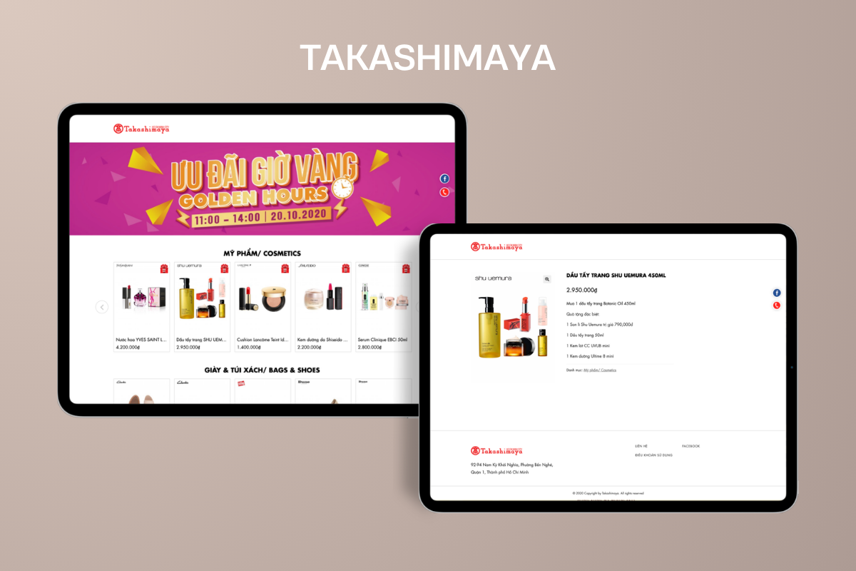
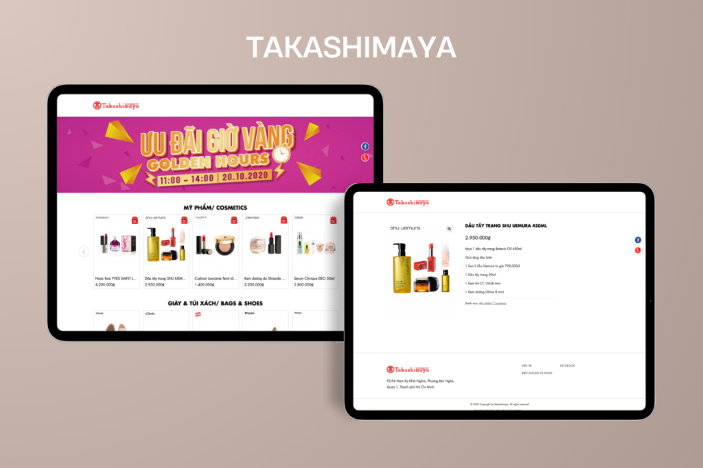
1. Campaign Landing Page
The landing page acts as the entry point for each promotion. It uses large visual banners to communicate the campaign theme, followed by structured product sections grouped by category.
For example, in the “Golden Hours” campaign, the interface highlights the promotion with a bold hero banner, then presents products in organized rows such as cosmetics, bags, shoes, and other categories. This allows customers to quickly understand the campaign and browse available offers.
2. Product Listing Experience
Products are displayed in a clean grid layout with product images, brand names, and pricing information. This structure makes the shopping experience simple and familiar while still keeping the interface visually aligned with Takashimaya’s premium retail identity.
The product cards are designed to support quick scanning, helping users compare products and move easily from browsing to product details.
3. Product Detail Page
Each product detail page provides focused information about a selected item, including product name, image, price, campaign offer, and related details.
The layout gives enough breathing space for product content, making the page feel clean and premium rather than overly promotional. This is especially important for categories such as cosmetics, gifts, and seasonal products, where image quality and product presentation strongly influence user interest.
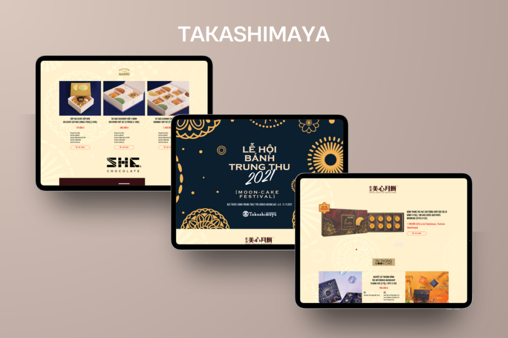
Seasonal Campaign Design
In addition to standard promotional campaigns, ZiniSoft also supported seasonal visual experiences such as the Mid-Autumn Festival campaign.
The Mid-Autumn campaign required a different visual direction from regular retail promotions. Instead of a simple product grid, the design used warmer colors, festive graphics, mooncake product visuals, and decorative patterns to create a seasonal atmosphere.
This allowed Takashimaya to present products not only as retail items, but also as gifting experiences connected to a specific cultural occasion.
The design direction helped communicate:
- A premium gifting experience
- Seasonal campaign identity
- Product variety across different mooncake brands
- Clear product pricing and call-to-action areas
- A festive but still elegant shopping interface